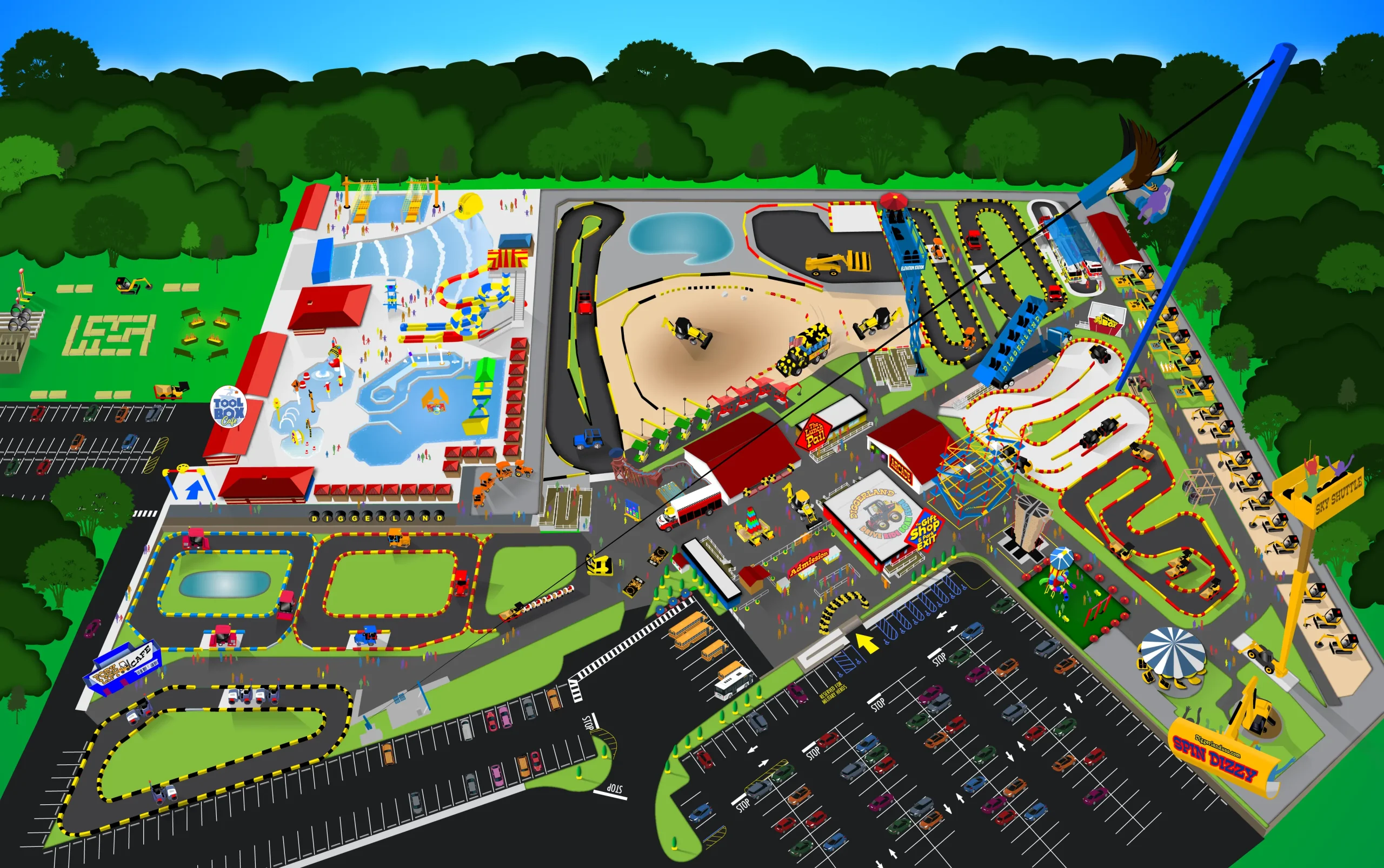
PARK MAP & BROCHURE

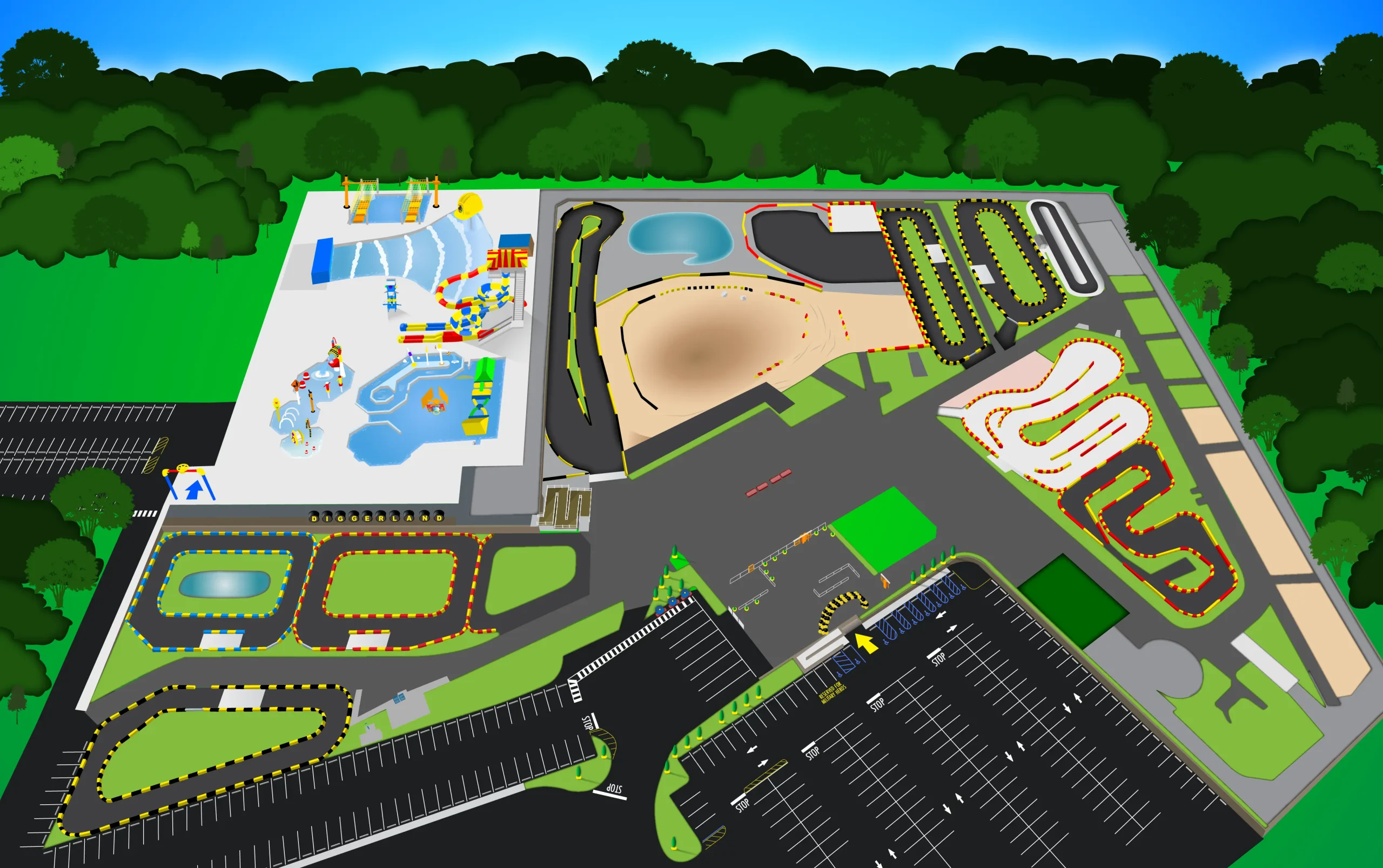
Final Park Map For Print & Digital
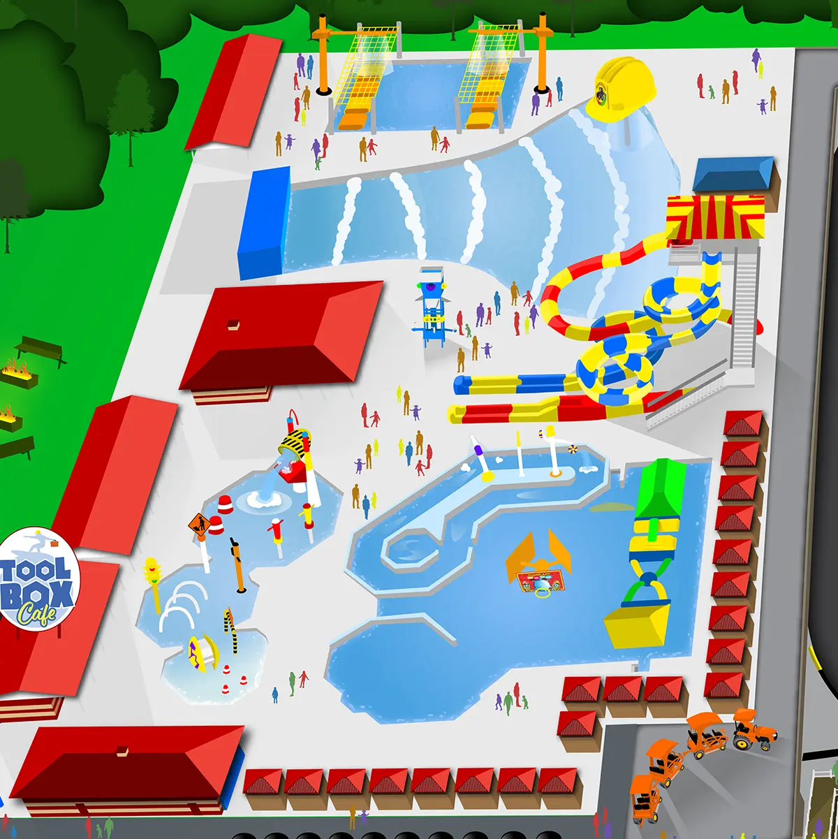
PROJECT SUMMARY
As the park prepared to unveil its all-new water attraction, we needed to replace an outdated map that lacked consistency and clarity. I set out to create a fresh, kid-friendly illustrated version that matched our branding while providing guests with a more accurate and visually engaging layout of the park. After researching map designs used by other theme parks, I chose to build our new version in Adobe Illustrator, layering elements to maintain flexibility for future updates.
PROCESS
Capturing the park from the right angle was essential—even though it was off-season and construction had already begun. Using a DJI Phantom Pro drone, I conducted multiple aerial shoots until I captured a high-quality image that fully encompassed the park layout. This photo became the foundation of my design: I placed it as a low-opacity reference layer and began mapping out the topography.
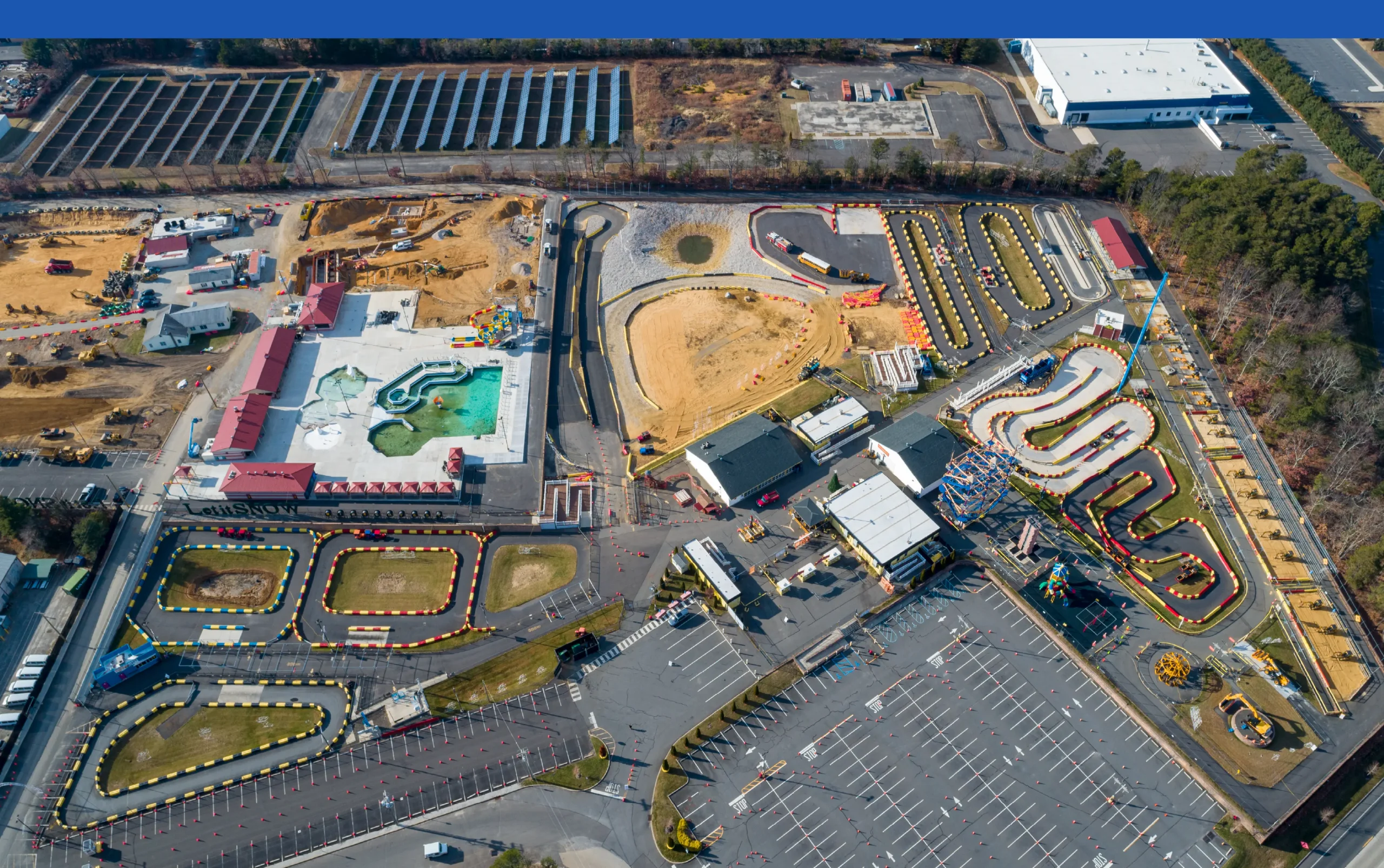
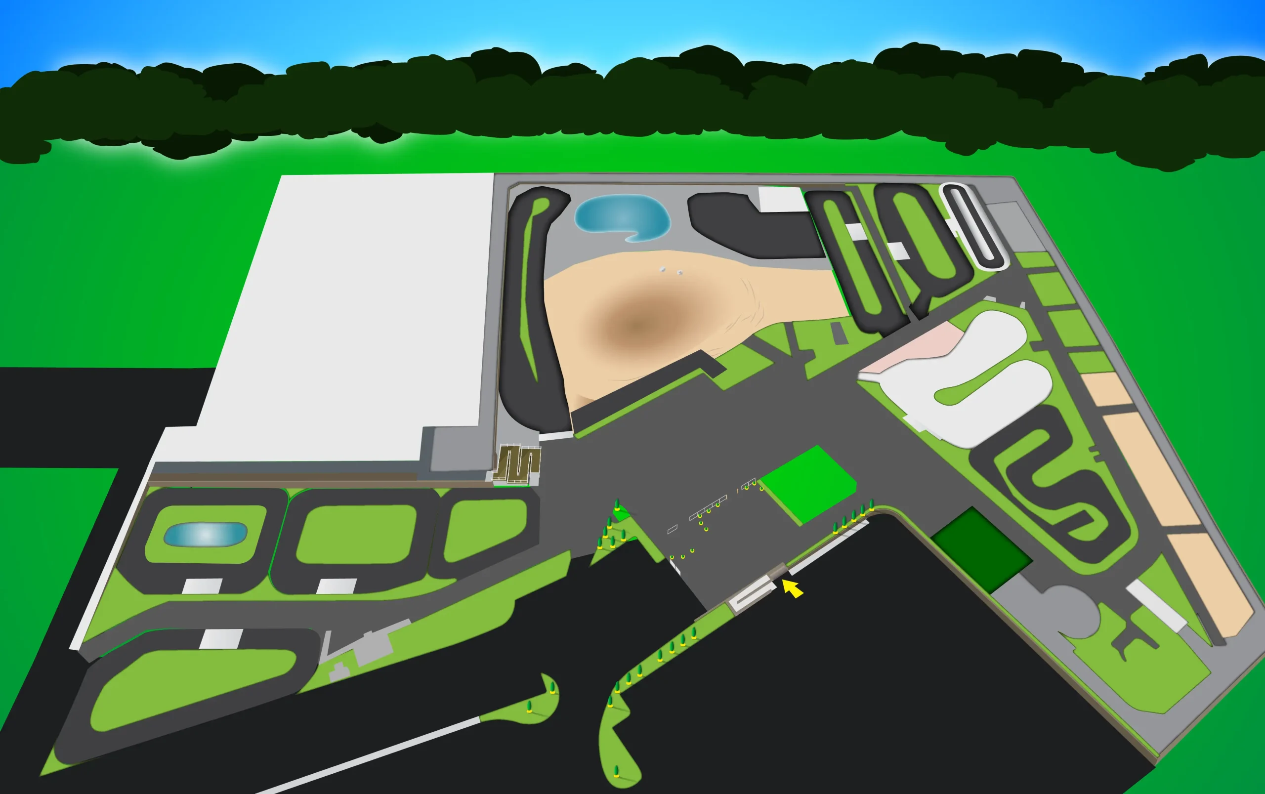
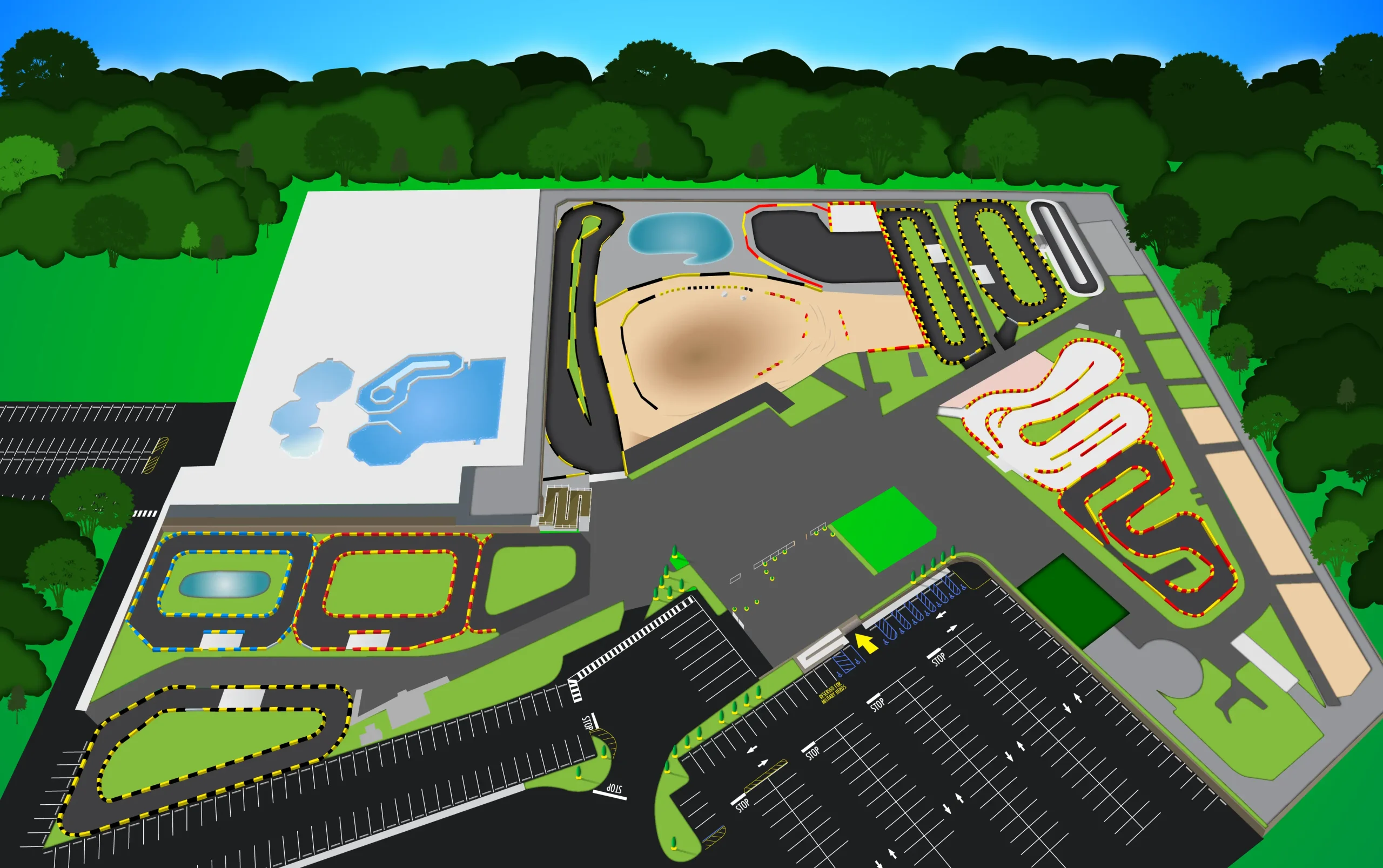
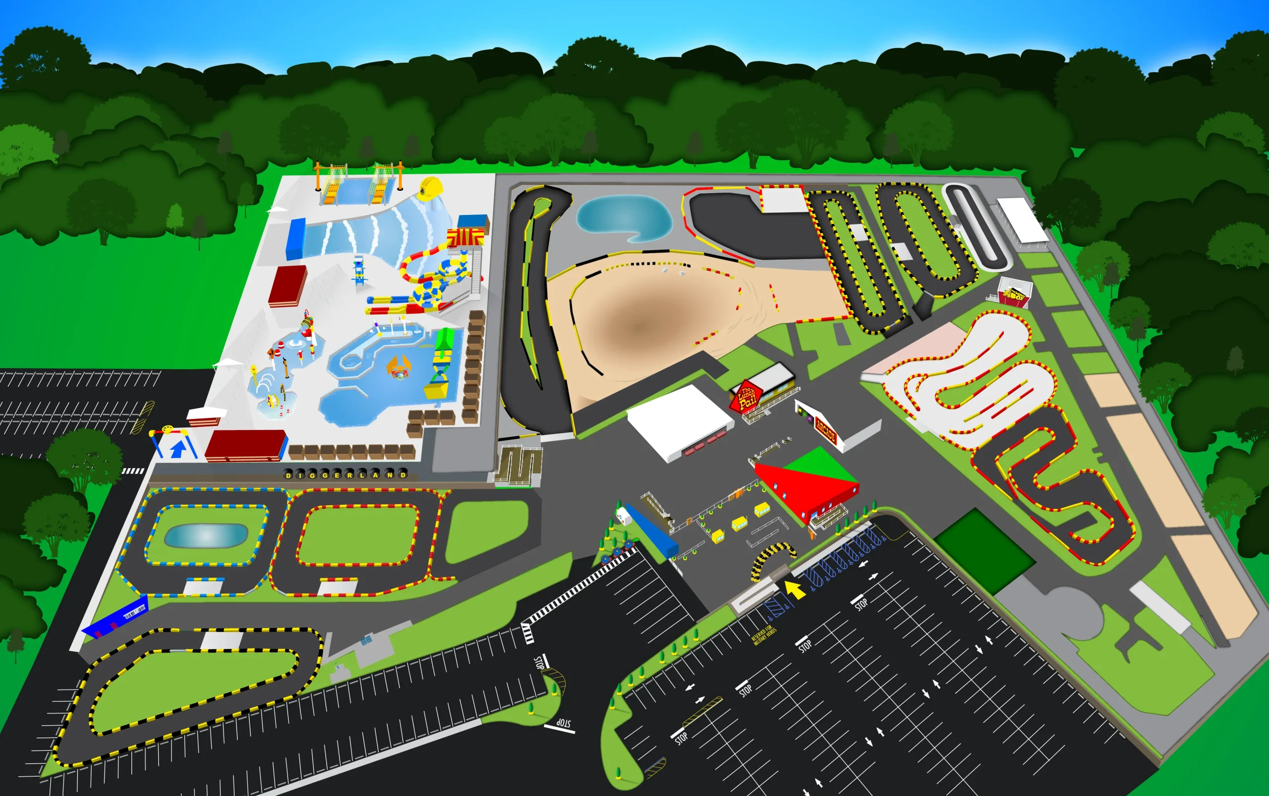
Park Map Developmental Stages
Each attraction was drawn as an individual vector element using the pen tool for precision, allowing me to zoom in and capture fine details. Logos were placed at corresponding ride and area locations, and to bring the map to life, I added whimsical touches like construction vehicles and colorful silhouettes of guests interacting with the park.
UPDATES & REVISIONS
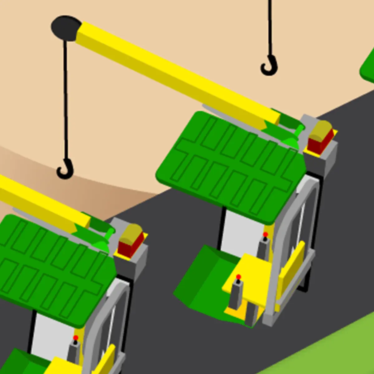
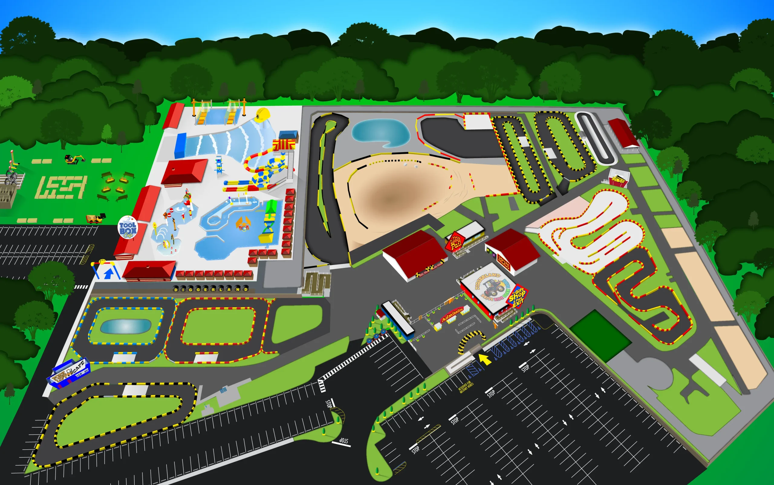
Crazy Crane From 3-D Plan
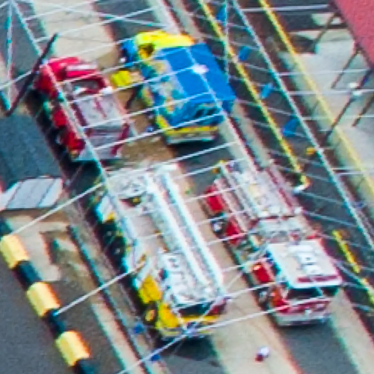
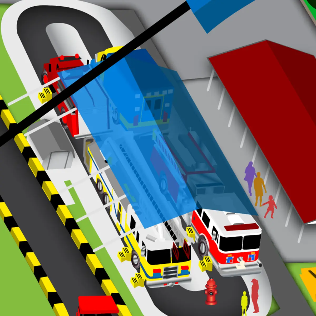
Hook & Ladder Added In 2023
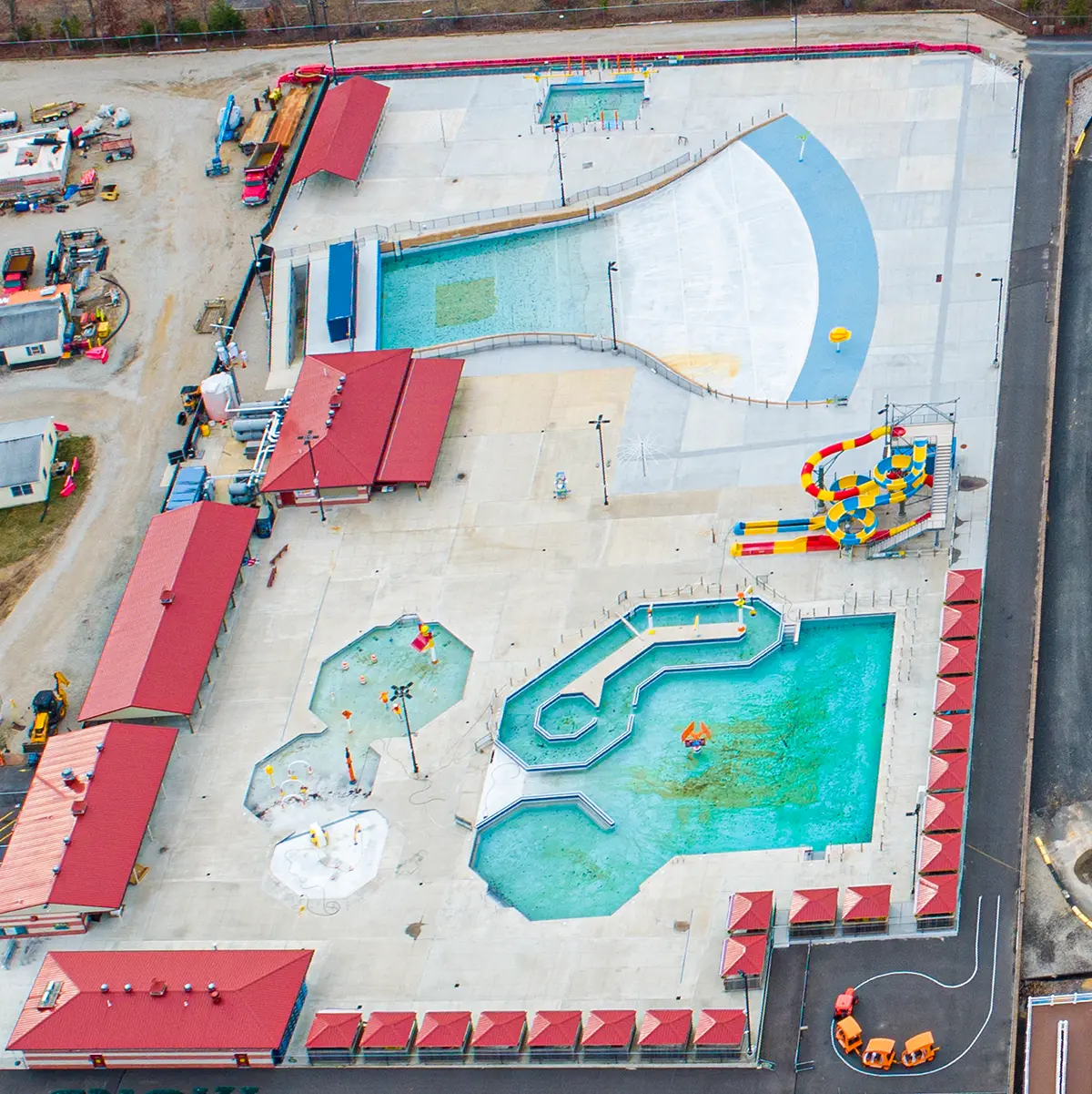
Water Park Additions
The map was designed with adaptability in mind. As new rides were added, I incorporated 3D plans and updated drone photography to accurately scale and position them. For example, once the wave pool was complete, I overlaid new drone images to finalize the layout. Over time, the map has been revised to reflect continued growth and improvements at the park.
BROCHURE DESIGN

Guest Park Map Brochure Outside
Guest Park Map Brochure Inside
To complement the new map, I designed a printed tri-fold brochure that doubled as a guest keepsake and guide. Beginning in Adobe InDesign and moving into Illustrator for text control, I carried over our construction-themed branding with fun, guest-friendly visuals. Key information included a ride operator license checklist for kids, height restriction icons for quick reference, and an illustrated map key where certain rides appear to leap out in 3D fashion.
This design has been printed on vinyl for in-park signage and widely distributed as a take-home brochure—both have been well received by guests and staff alike.
YOU MIGHT ALSO LIKE